
Designing for the scroll: creative rules for fullscreen mobile ads
A fullscreen mobile ad is something the reader scrolls through, not something they look at. Here is how we design for that, frame by frame, with live examples.
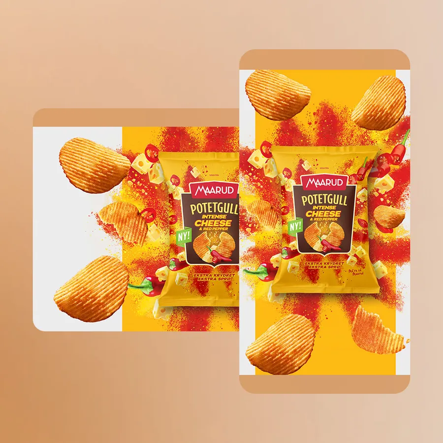 Maarud - SplashDouble midscroll · live demo ↗
A fullscreen mobile ad works when it is designed for the thumb, not for the screenshot. The reader scrolls it in from below, has the whole screen for a moment, then scrolls it away. Good mobile ad design plans all three moments: put the brand in the first frame, say one thing per screen, keep text inside the safe area, assume the sound is off, and let motion follow the scroll instead of fighting it.
That is the short answer. The rest of this guide is how we apply it to midscrolls, double and triple midscrolls and topscrolls, the formats Nordic publishers sell as high impact, with real ads you can play.
How the reader meets a scroll format
Every scroll format has a different entrance and exit, and the creative has to suit them.
| Format | How it appears | What that means for the design |
|---|---|---|
| Topscroll | Opens the page at 70–90% of the screen height and pushes the content down. As the reader scrolls, the content moves up over it. | The first frame is the whole ad, seen before anything else. It leaves from the bottom up. |
| Midscroll | A full-screen ad between the articles. The reader scrolls into it, and on past it. | It enters from below, holds the screen, then leaves upwards. |
| Double midscroll | Two fullscreens stacked. As the reader keeps scrolling, the second scene is revealed. | One placement, two scenes, so you can tell a short story. |
| Triple midscroll | The same idea, three screens long. | A three-step sequence: set-up, turn, pay-off. |
The descriptions for the first three come straight from our ad format specs. If you want the background on the formats themselves, start with our field guide to high-impact ads.
Ad formatMidscrollSometimes called an interstitial or fullscreen, this format is a full screen ad that appears before, after, or between the content of a website.Specs →Think in frames: entering, full screen, leaving
Designers usually present a fullscreen ad as one perfect still. The reader never sees that still for long. They see a sequence:
- Entering. The top edge of the ad slides up from the bottom of the phone. Whatever sits at the top of your canvas is read first, often while the article is still on screen.
- Full screen. For a beat, the ad owns the screen. This is where the message lands.
- Leaving. The ad slides off the top. The bottom of your canvas is the last thing seen, which makes it a natural home for the CTA.
So storyboard it. Sketch three frames per screen, not one. If the entering frame is an empty sky and the leaving frame is a cropped packshot, the ad has wasted two thirds of its time.
Brand in the first frame
The reader decides in the entering frame whether to slow down or flick past. If they flick, the only thing you can still win is recognition. Put the logo, the brand colour or the product where it will be seen first.
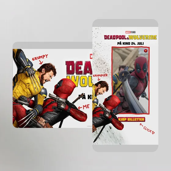
Deadpool & Wolverine does this well. The title lockup and release date build in over the key art as soon as the first screen arrives. The trailer waits for the second screen, with the lockup repeated beside it. A reader who stops for half a second still knows what film it was.
One message per screen
A phone screen holds one idea comfortably. Two ideas compete, and three become small print. If you have a launch message, an offer and a CTA, that is a double or triple midscroll, not a crowded single.
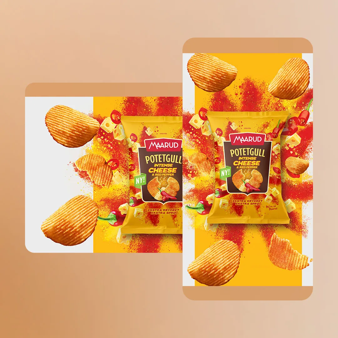
Maarud – Splash is a clean example of one message per screen. The first screen is the logo and a three-word headline that builds in line by line. The second is the product: as the reader scrolls on, the bag lands with its splash, cheese, chillies and crisps flying out around it, and the slogan sits underneath.
Type you can read on a phone
Most fullscreen ads are built from 1080×1920 portrait artwork that is shown on a phone a few centimetres wide. Text that looks bold on a monitor turns into a grey line on a phone. Our rules of thumb:
- Check every layout at real size, on a real phone, before anything else.
- Keep headlines short enough to set big. Cut words before you cut point size.
- Avoid thin weights and long body copy over busy images. Add a tint or plain field behind text.
- Use an overlay for text where you can. The spec pages describe uploading a clean background and adding text, logo and CTA as an SVG or PNG overlay, which keeps the text crisp and makes new versions cheap.
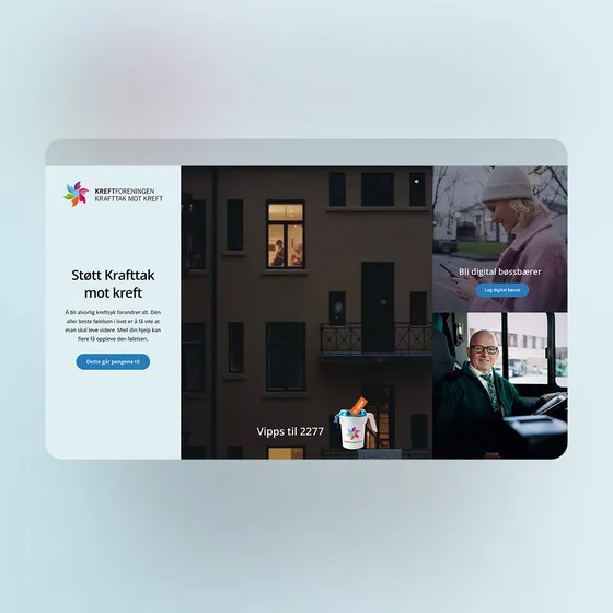
When the ad is built in HTML rather than baked into the artwork, the type can scale with the screen. In the Kreftforeningen midscroll, the portrait layout sizes its type to the screen height, so the headline holds its place on short and tall phones alike.
Safe areas: what the specs say
A fullscreen ad is cropped differently on every phone, so important content must sit inside the safe area. These are the numbers from our spec pages:
| Format | Portrait (1080×1920) | Square (1080×1080) | Landscape (1920×1080) |
|---|---|---|---|
| Topscroll | 940×1240 | 640×700 | 1400×620 |
| Midscroll | 940×1670 | 528×940 | 1400×940 |
| Double midscroll | 940×1670 | – | 1400×940 |
Logo, text and CTA go inside. Background, texture and the parts of an image you can afford to lose go outside. The topscroll safe area is shorter because the ad shows at 70–90% of the screen, not all of it. Templates are on each format page, and some publishers use their own safe areas, so check with them before you finalise.
Sound off, story on
Assume nobody hears your ad. Sound is off by default on mobile pages, and a fullscreen ad that needs audio to make sense fails for almost everyone. Put the story in the pictures and the words, and offer sound as a bonus.
The video demos in this guide follow the same pattern: the video plays muted, with a small sound button, a replay button when it ends and a play button if it pauses. In Avatar: Fire and Ash the trailer starts when the reader reaches the last screen, and is muted again if they scroll back up.
Motion that follows the scroll
The best scroll ads move _because_ the reader moves. Instead of a timeline that runs on its own, the creative sets waypoints: points in the scroll where something happens. Scroll past one and the next element arrives; scroll back and it reverses. The ad never plays its best moment to someone who has already scrolled away.
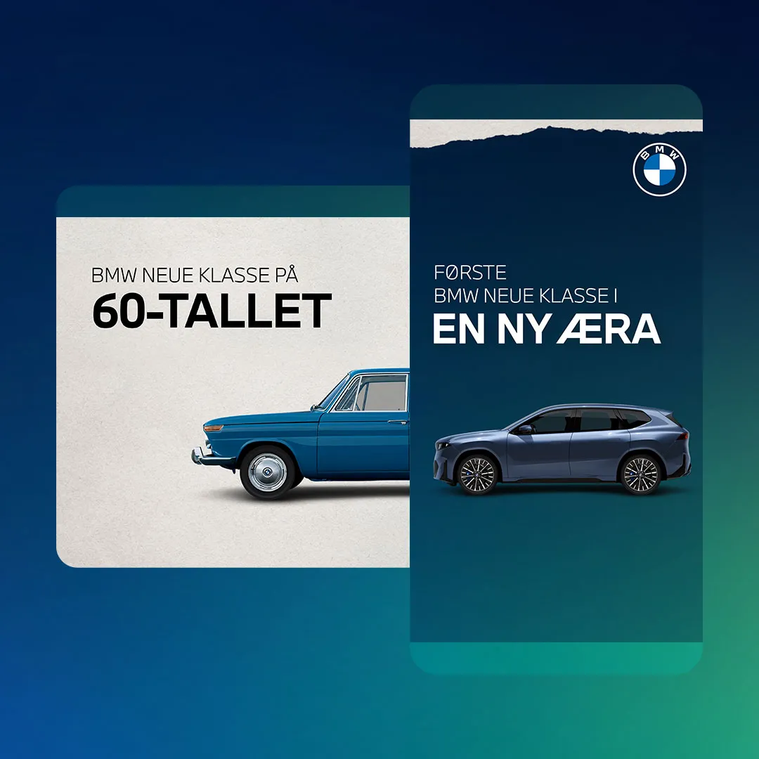
BMW – New era is built this way across three screens. As the first screen comes in, a classic Neue Klasse car drives in from the side with its wheels turning. Further down, it drives out, the old logo gives way to the new one and the new car rolls in. On the last screen comes the headline that this is the most important new car in decades, the line "Nye BMW iX3 er her" and a "Les historien" button.
Keep the motion short and tied to a waypoint. A half-second slide or fade that finishes while the reader is still on that screen beats a long build they will miss. For mechanics that go beyond scroll, such as swipes, pickers and games, see our guide to interactive ad ideas that work in a scroll.
Double and triple midscroll: design a sequence
A double midscroll is two scenes, each with a background and up to three overlays. The spec suggests one overlay as an always visible item, such as a logo or CTA, and the other two as messages. That structure is a good discipline even when you build something more custom: one constant, and a message that changes as the story moves on.
Plan it like a three-panel comic. Each screen needs to work alone, because some readers stop halfway, and together they should build to a pay-off.
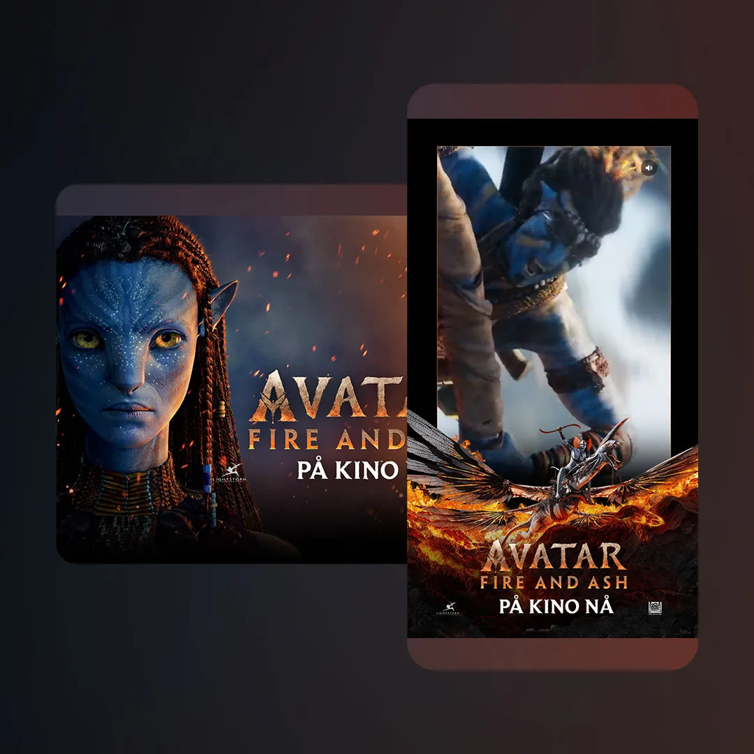
Avatar: Fire and Ash runs as a triple midscroll. The first screen brings in the logo and the title copy. The second has a background video with the logo and copy again, so a reader who arrives late still gets the brand. On the third, a trailer box slides up and plays. The copy artwork changes by date too, so the message shifts as the release gets closer.
Choosing assets: video, image or products
The format sets some limits. A double midscroll cannot use two videos, because the ad gets too heavy: use a colour, an image or a video for one scene and a colour or image for the other. For each format, the spec pages list the file types (.mp4, .mov, .webm, .webp, .svg, .jpg, .png) and the asset sizes.
Beyond the rules, pick the asset for the job:
- Video when movement is the message: a trailer, a car, a place. Stream it so it plays fast without a heavy file. Our streamed video page explains how, and the guide to video in display ads goes deeper.
- Image when one strong picture says it. Cheaper to version, and crisp on every screen.
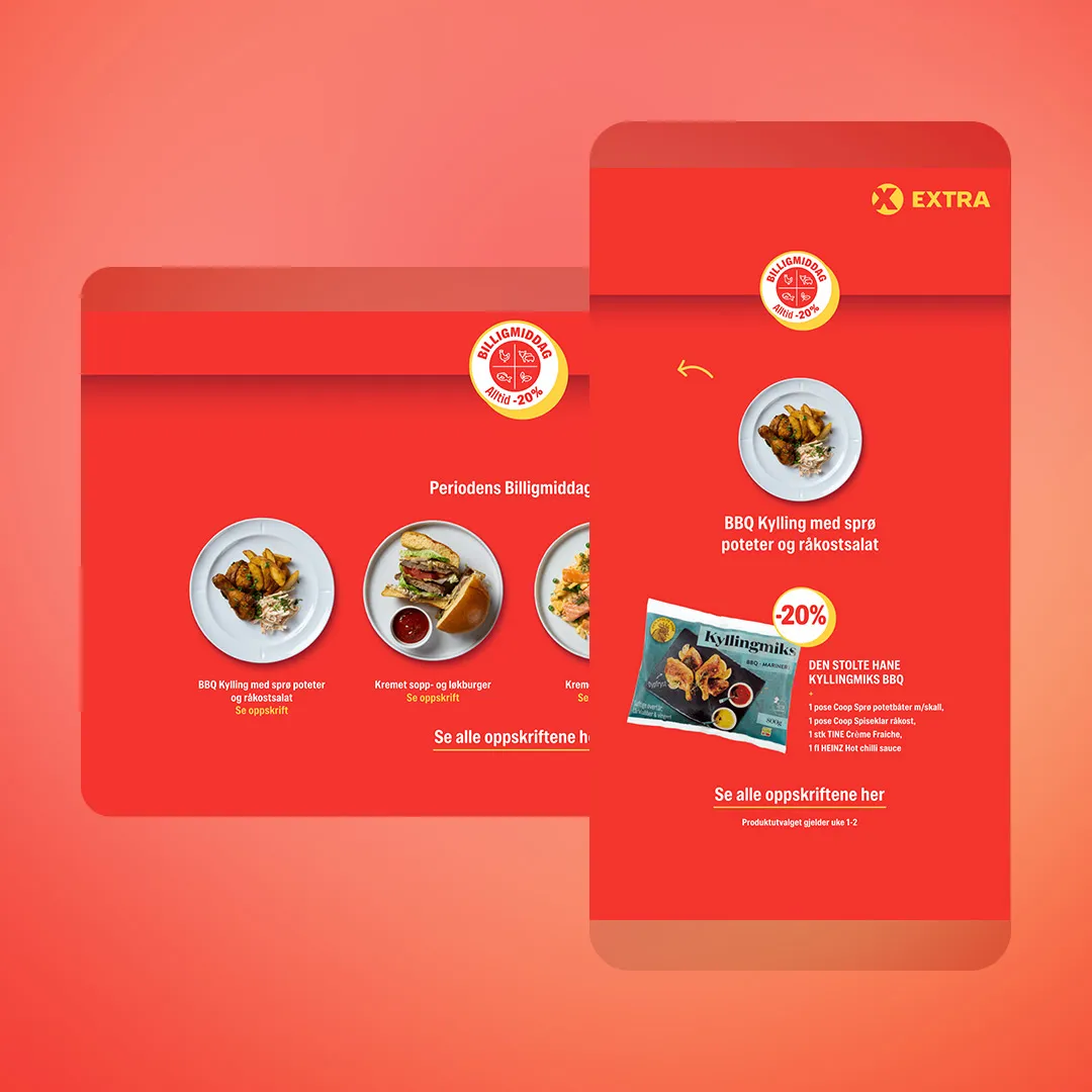
- Products when the reader is shopping. Coop Extra – Recipes uses its second screen for four dinner tiles. Tap one and it opens the recipe, with the pack shot and the ingredient list, and a button to see all the recipes.
When the same campaign needs many sizes alongside the scroll formats, MAiKE, our AI banner maker, builds the ad in every format from a single page.
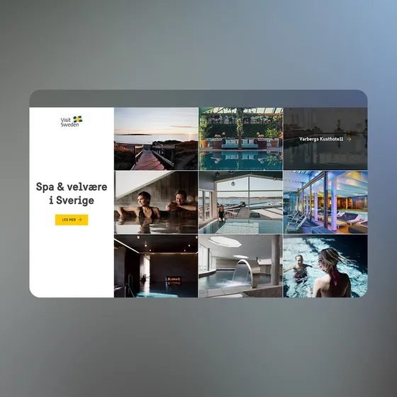
More scroll ads to play with, including a collage that shows each photo's name in turn on mobile and a charity midscroll with a video and rotating story tiles:
 Open live demo ↗
 Open live demo ↗
 Open live demo ↗
Handover checklist
Before you send a scroll format to production, check:
- The entering frame shows the brand, the product or the brand colour.
- Each screen carries one message, and each screen still makes sense alone.
- Logo, text and CTA sit inside the safe area for every asset you deliver.
- You have a portrait (1080×1920 or 1080×1080) and a landscape (1920×1080) asset, or you have agreed on mobile or desktop only.
- Text has been checked at real size on a phone.
- The ad tells its story with the sound off.
- Motion is tied to the scroll and finishes while the reader is still on that screen.
- A double midscroll uses at most one video.
- Text, logo and CTA are delivered as separate overlays where you want them crisp or need versions.
- The publisher's own safe areas have been checked.
What is a fullscreen mobile ad?
An ad that takes the whole phone screen as the reader scrolls past, then lets the content carry on. Publishers call it a midscroll, an interstitial or a fullscreen.
What size should a fullscreen mobile ad be?
Deliver a 1080×1920 portrait asset (or 1080×1080 for a midscroll or topscroll) and a 1920×1080 landscape asset. Station adapts the ad to every screen.
What is the safe area on a midscroll?
940×1670 on a 1080×1920 portrait asset, 528×940 on a 1080×1080 square asset and 1400×940 on a 1920×1080 landscape asset. Keep logo, text and CTA inside it.
Can both scenes of a double midscroll be video?
No. Two videos make the ad too heavy, so use video for at most one scene and a colour or image for the other.
Should a mobile ad rely on sound?
No. Design it to work with the sound off and offer a sound button for readers who want it.
What is the difference between a double and a triple midscroll?
A double midscroll stacks two fullscreen scenes in one placement and a triple midscroll stacks three. Both reveal the next scene as the reader keeps scrolling.