
Interactive ads that work in a scroll: eight mechanics, with live examples
Eight interactive ad mechanics we build again and again, what each one is good for, where it breaks, and a real ad you can play for every one.
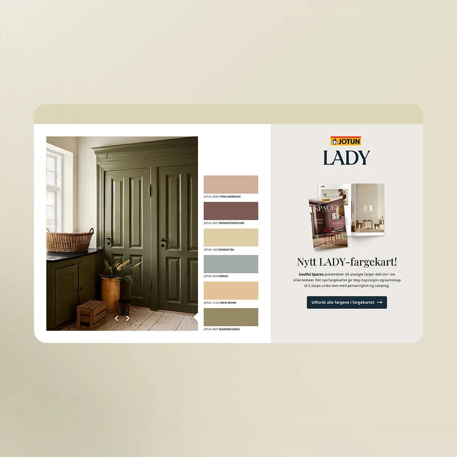 Jotun - Color chartMidscroll · live demo ↗
Interactive ads let the reader do something: pick a colour, swipe through products, tap a hotspot, drag a pin. The ones that work inside a scrolling page share three traits. There is one obvious thing to do, the ad still makes sense if nobody touches it, and the reward for touching it arrives at once. Below are the eight mechanics we use most, each with a live example from our own work.
Most of these are rich media ads on high-impact placements such as the midscroll, where the ad has the whole screen for a moment. A few run in standard display sizes. All of them are real campaigns you can play.
Why interaction is hard in a scroll
A reader on a news site is moving. Their thumb is busy scrolling, and the ad has a second or two before it slides away. That is why an interaction cannot be the price of entry. If the ad is blank until someone taps, most people will never see it.
So we design every interactive ad in two layers. The first layer plays by itself as the reader scrolls: it animates, cycles and tells the story. The second layer is for the people who stop. Do that well and interaction becomes a bonus that rewards attention instead of a barrier that wastes it.
1. Colour pickers
What it is. A row of swatches next to a product. Tap one and the product changes colour.
Why it works. It is the most natural interaction there is. Everyone knows what a swatch does, the reward is instant, and it answers a real buying question: what would mine look like?
When it fails. When the swatches are too small for a thumb, or when the colours are so close that the change is hard to see.
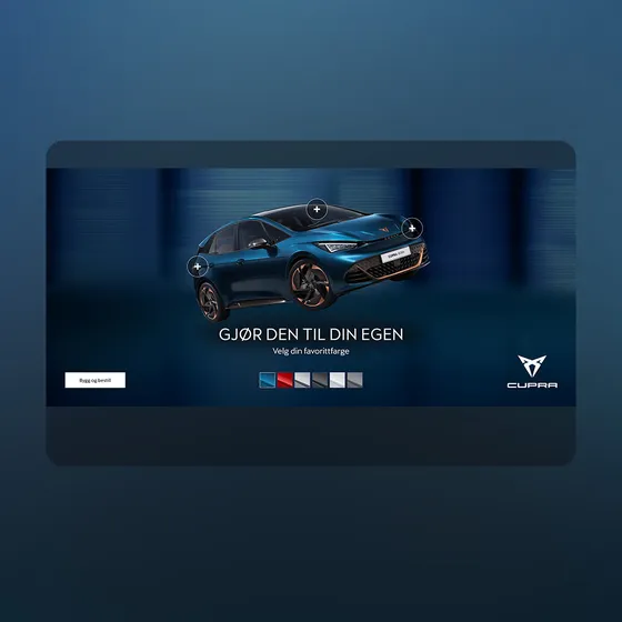
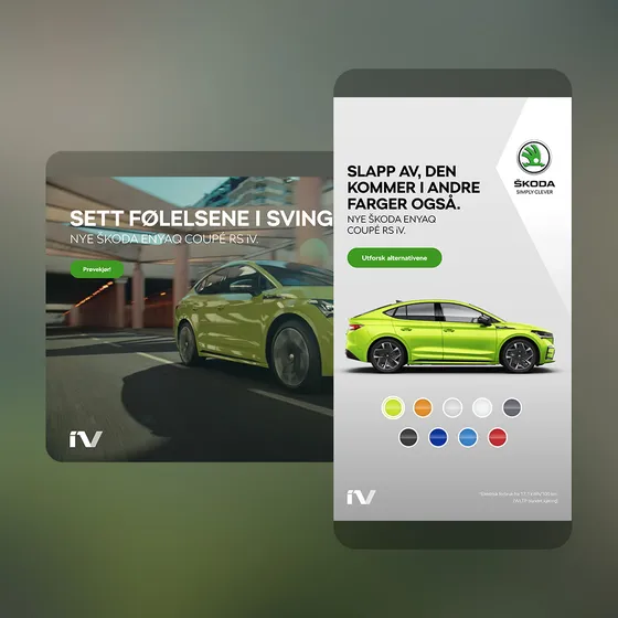
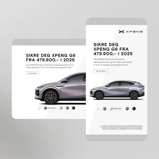
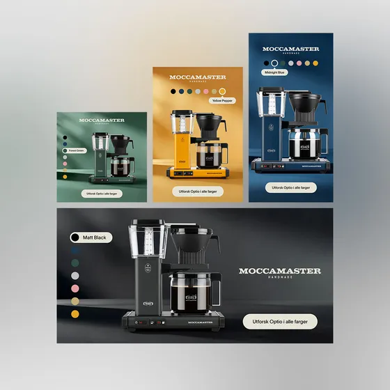
In the Cupra topscroll the reader picks one of six colours and the car changes, and three plus signs on the car open short streamed videos. The Škoda double midscroll offers nine colours, with copy that changes as you scroll: the second scene says the car comes in other colours too. The Xpeng picker labels its five colours by name. The Moccamaster ad for the Optio coffee maker runs in standard display sizes: it cycles through seven colours by itself in random order, and the reader can tap a colour or swipe to take over.
 Open live demo ↗
 Open live demo ↗
 Open live demo ↗
 Open live demo ↗
2. Swipeable carousels and product browsing
What it is. A set of products, offers or scenes the reader can step through with a swipe or arrows.
Why it works. It packs more into one placement without making the screen busy, and swiping sideways is already a habit on a phone.
When it fails. When it waits for the reader. A carousel that only moves on a swipe looks like a single static frame to everyone who keeps scrolling.
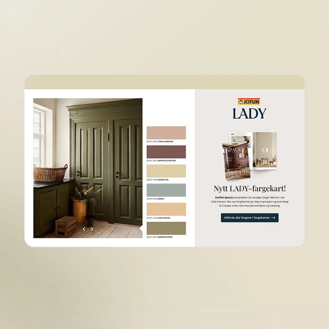
The Jotun ad shows the rule in action: it browses itself until the reader takes over, then stops and follows them. The Power double midscroll does the same with retail offers. A product carousel with prices and savings plays on its own, loops, and can be swiped or stepped with arrows. For carousels fed by a live product feed, see our page on dynamic creative.
3. Hotspots and highlights
What it is. Points on an image that open more detail: a feature, a close-up, a short film.
Why it works. The reader explores the product the way they would in a showroom, and the ad can hold far more information than a single frame can carry.
When it fails. When the hotspots do not look tappable, or when what opens behind them is weaker than the picture they sit on.
The HTH kitchen midscroll has five pulsing hotspots. Each opens a card with a picture or a video of one feature, such as the drawers or the appliances, and a close button. The Xpeng highlights double midscroll takes the hands-free route: when it scrolls into view, four feature boxes, among them fast charging and comfort, light up one after another, and each box has its own click-through.
4. Collages
What it is. A grid of images, each one its own small story, with one highlighted at a time.
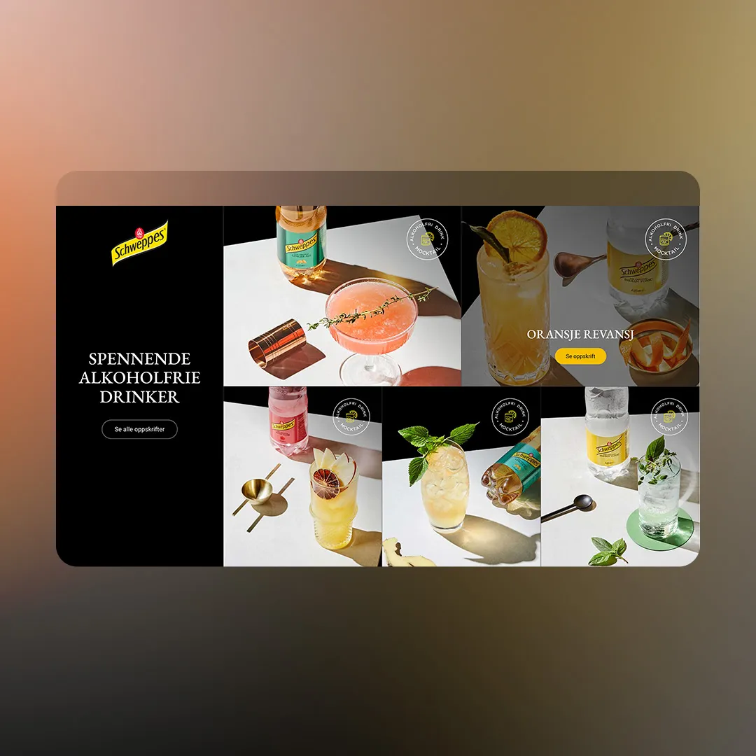
Why it works. It shows range at a glance: five drinks, nine places, a whole collection. It also suits brands with strong photography.
When it fails. When the tiles are so small on a phone that nothing reads.
The Visit Sweden collage uses nine spa hotels along the Swedish coast. On a phone the tiles take turns to show their names, and on a desktop they light up when you hover over them.
5. Scroll reveals and flips
What it is. The reader's scroll is the interaction. As the ad moves up the screen, a door opens, a card turns or a product appears.
Why it works. It asks for nothing. Everyone who scrolls past sees the full sequence, which makes it the safest mechanic on this list. The reveal also gives the ad a beginning, middle and end.
When it fails. When the reveal comes too late in the scroll and the reader has moved on before the pay-off.
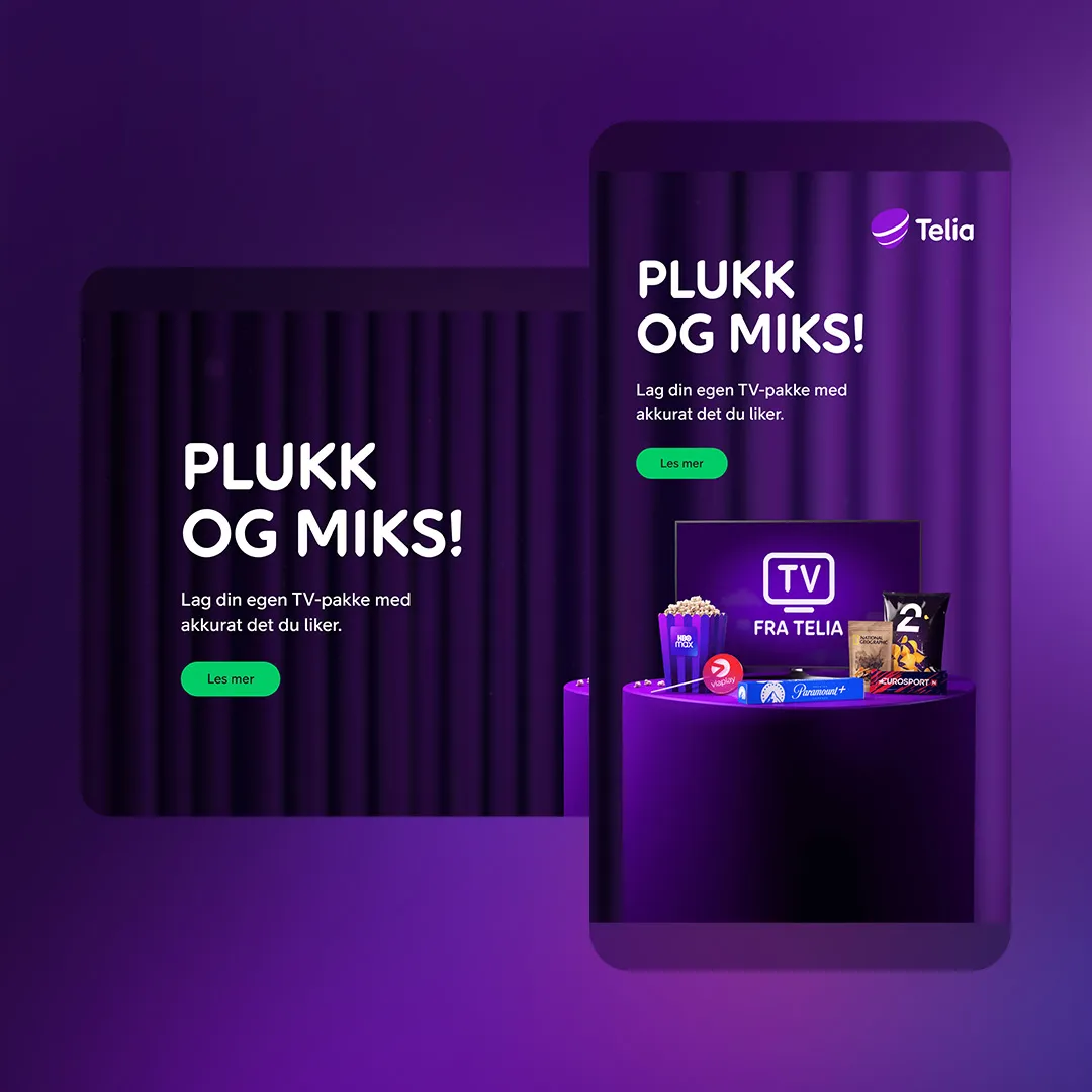
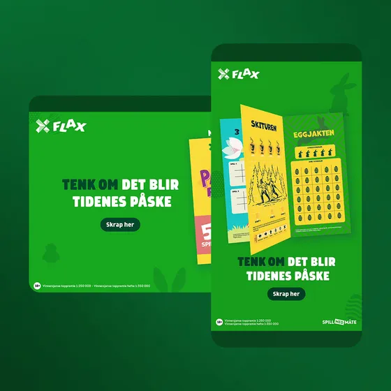
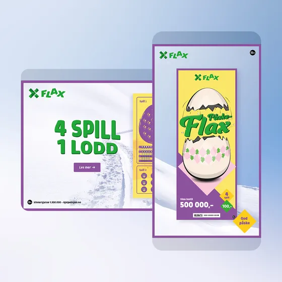
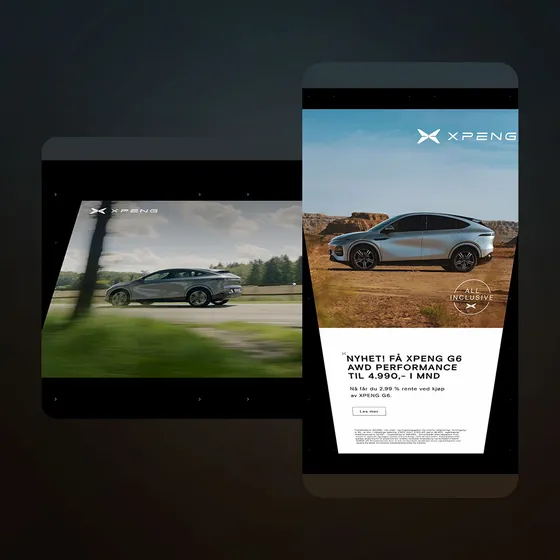
The Flax ads open like cards: in one, a single card swings open as you scroll; in the other, the pages of a booklet turn one by one. The Xpeng flip turns a card over as you scroll, from a video with the brand line to the offer. Reveals belong on the double midscroll, where there is enough scroll to tell the story.
 Open live demo ↗
 Open live demo ↗
 Open live demo ↗
6. Drag and vote
What it is. The reader drags or flings something to a target, and the ad answers.
Why it works. Dragging is physical and a little bit playful, and a vote gives the reader an opinion to express. It suits entertainment, sport and anything with a contest in it.
When it fails. On a page where dragging fights the scroll. The draggable objects need to be large and clearly separate from the rest of the page, which is why this mechanic belongs on a fullscreen format.
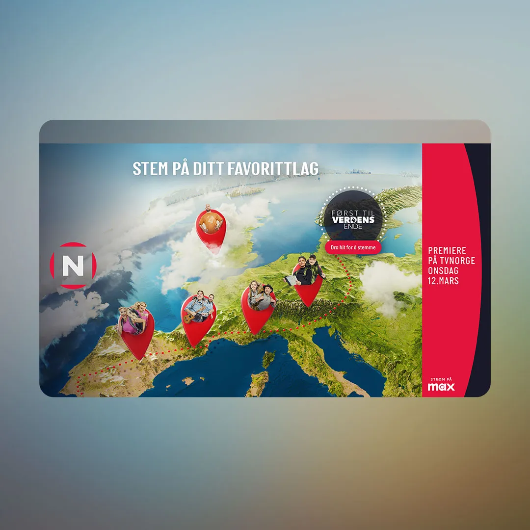
The same ad also changes its footer copy by date, from the premiere date to "tonight" on the day itself.
7. Playful grids and mini-games
What it is. A small game-like layout that invites a tap: a grid of tiles where something pops up, a choice to make.
Why it works. A hint of play earns a second look, and a grid lets one ad carry a whole line-up.
When it fails. When the game needs rules. If the reader has to read instructions, the ad has already lost.
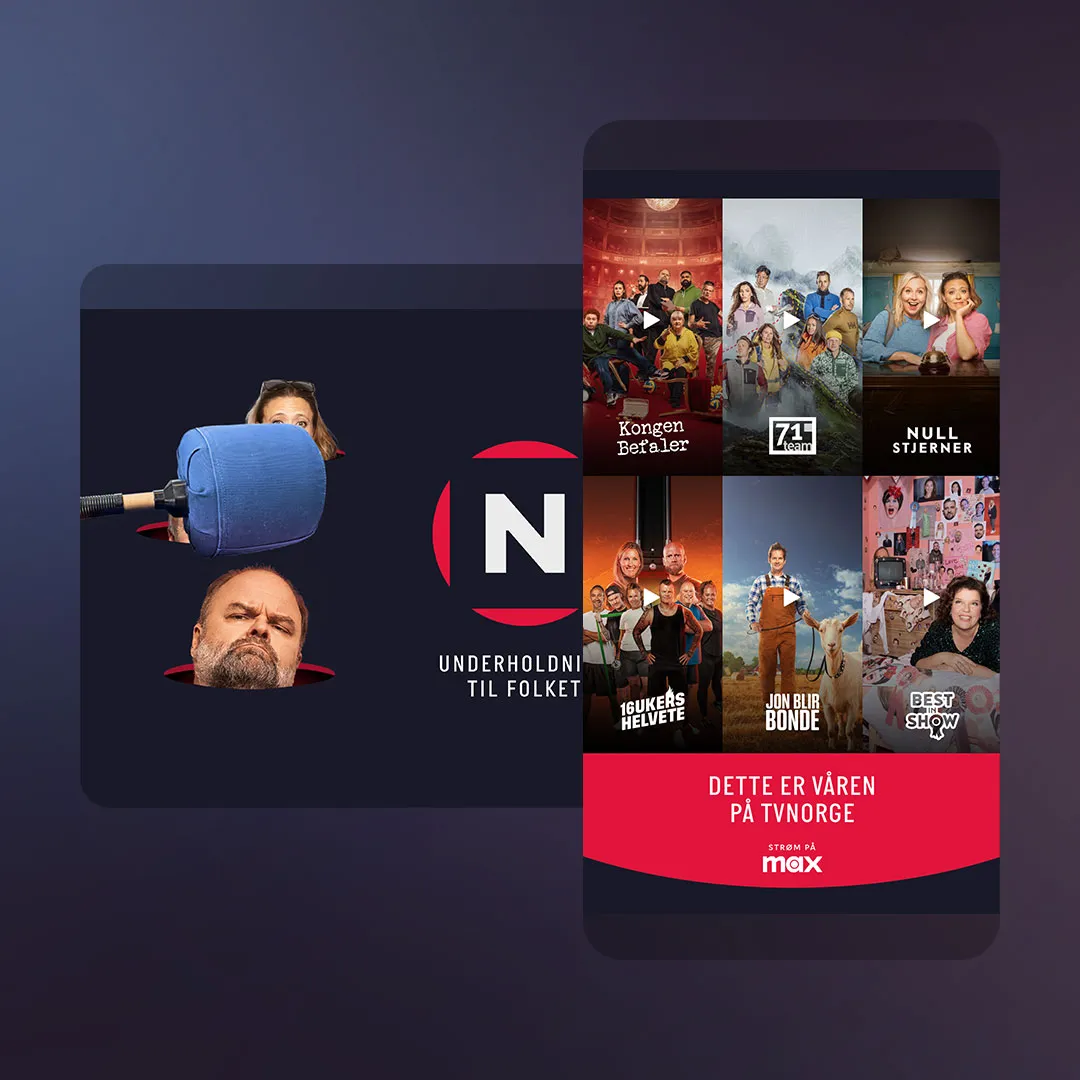
Both TVNorge ads use streamed video for their clips, which keeps the ad light until someone asks for more. Our streamed video page explains how that works.
8. Countdowns and time-aware copy
What it is. Copy that changes with the date or time: days to a premiere, "tonight", a sale that ends at midnight.
Why it works. It makes the ad feel current, and it can be built so it needs no tap at all.
When it fails. When the dates are wrong. A countdown that reaches zero and keeps running, or a "tonight" that is three days old, does more harm than plain copy. Build the end state before launch.
The TVNorge drag ad above is a web example. Countdowns are just as strong on digital screens; our guide to data-driven DOOH covers that side.
Craft principles for interactive ads
Whatever the mechanic, the same five rules decide whether it works.
- One interaction. Pick the single thing the reader can do and design around it. Colour plus hotspots plus a carousel is three ads in one frame.
- An obvious affordance. Swatches look like swatches, hotspots pulse, arrows sit at the edges. If you need to write "tap here", the design is not doing its job.
- It works without interaction. Let the ad cycle, reveal or animate by itself. Every ad above does something for the reader who never touches it.
- A fast reward. The change happens on the tap, not after a loading spinner. Load heavy content, such as video, only when someone asks for it.
- On brand. The mechanic serves the product. A colour picker for a car brand that sells on colour, a vote for a show that is a contest. Play for its own sake reads as noise.
For more on how readers meet these formats, from the first frame to the CTA, read designing for the scroll.
Interactive ad mechanics at a glance
| Mechanic | Best for | Demo |
|---|---|---|
| Colour picker | Products sold on colour or finish | Cupra, Škoda, Xpeng, Moccamaster |
| Swipeable carousel | Ranges, offers, collections | Jotun – Color chart, Power – Low |
| Hotspots and highlights | Products with several features to explain | HTH, Xpeng – Highlights |
| Collage | Range at a glance, strong photography | Schweppes, Visit Sweden |
| Scroll reveal or flip | Story with a pay-off, an offer behind a brand line | Telia, Flax, Xpeng – Flip |
| Drag and vote | Entertainment, sport, contests | TVNorge – Drag the winner |
| Playful grid | A line-up of shows, products or episodes | TVNorge – Whack A Mole |
| Countdown or time-aware copy | Premieres, launches, deadlines | TVNorge – Drag the winner |
You can browse every example, and many more, on our inspiration page.
What is an interactive ad?
An interactive ad is a display ad the reader can act on inside the ad itself, for example by picking a colour, swiping through products, tapping a hotspot or dragging an object. The best ones also work for readers who just scroll past.
What is the difference between rich media ads and interactive ads?
Rich media is the wider term for ads with more than a static image, such as animation, video or expanding layouts. Interactive ads are rich media ads where the reader can do something, not just watch.
Which ad formats suit interactive ads best?
Fullscreen mobile formats such as the midscroll, double midscroll and topscroll, because the ad owns the screen for a moment and has room for thumb-sized controls. Simple mechanics like a colour picker also work in standard display sizes.
Should an interactive ad still work if nobody interacts?
Yes. Most readers will scroll past without touching the ad, so it should animate, cycle or reveal by itself and deliver its message without a tap.
What are good interactive ad ideas for a product launch?
A colour picker or hotspots for a physical product, a scroll reveal that ends on the offer, or time-aware copy that counts down to launch day. Choose the one mechanic that answers the buyer's main question.